Today we are gambling in class!
As students enter, please get 3 pennies and wager with each other.
Rules:
- You must find someone to wager against and continue wagering with that person.
- Take turns flipping and wagering (one person picks the wager (how many coins) and one calls heads/tails).
- When I pause the action, be sure to count your coins and be counted!
Charting the distribution of coins
round 1 2 3 4 5
#coins
BEGIN WAGERING!
Today's lesson:
- How does the simulation resemble social class in the US?
- What is the median income in the US?
- How does your family's income or the average person in your hometown compare?
- What does the median/typical American look like in terms of wealth, education, location, power and prestige?
- How does your family or the typical family from your hometown compare to the typical US household?
- How do all of these components affect each other?
A Metaphor for Our System
Americans Believe that the Economic System is Fair and Equal
If everyone starts with three coins, what do you think will happen as the contest goes on?
Like life in the U.S., the exercise had the appearance of being fair and equal - everyone had a 50% chance of winning. The U.S. is an open system - not a caste system or closed system like a monarchy or apartheid. Because the American system technically allows anyone to move up, it gives the impression that everyone has an equal chance and that the system is fair. The coin flip metaphor seems like everyone has a 50-50 chance to succeed. This is true for U.S. society too. From Jen Hochschild's book, Facing Up to the American Dream, Americans believe in the "American dream;" success is attainable for anyone. However, just like real life, the coin game takes a little luck. If you are lucky enough to be born into wealth, it is an advantage just like being lucky to win early in the game.
The Difficulty of Defining Middle Class
Most Americans claim to be in the middle class. People making $30K per year to people making $200K per year claim to be in the middle class. Because Americans hate the idea of a class system, most Americans prefer to think of themselves as middle class. This 2015 article from Smithsonian Magazine details a number of sources that show Americans like to believe that they are middle class. However, rather than being a society of equality or a society of people in the middle, America has the highest rate of poverty among the 17 leading industrial nations. Most wealth is at the top in the hands of very few people and most people are at the bottom with very littleHowever, defining the middle is difficult because there is so much money skewed to the top and there are so many people at the bottom. Even though the game has the appearance of being an equal 50-50 chance, the rules favor a channeling of wealth to the top. Every time we play this, the outcome is similar: most money at the top and most people at the bottom with very little money. This is true in real life as well as the metaphor. The wealth distribution in the U.S. resembles a Lorenze curve (here):

Compare this graph to a graph of the coin distribution at the end of the game.
Some of the specific similarities include:
- How difficult it is to define the middle class.
- The huge disparity between those at the top and those at the bottom.
- The large number of Americans who have no wealth/no coins.
Rather than being a society of equality or a society of people in the middle, the US has one of the highest rates of poverty and inequality out of the most developed countries in the world.
Most Americans believe that a rising tide should lift all boats—that as the economy expands, everybody should reap the rewards. And for two-and-a-half decades beginning in the late 1940s, this was how our economy worked. Over this period, the pay (wages and benefits) of typical workers rose in tandem with productivity (how much workers produce per hour). In other words, as the economy became more efficient and expanded, everyday Americans benefited correspondingly through better pay. But in the 1970s, this started to change...Income trends have varied from state to state, and within states. But a pattern is apparent: the growth of top 1% incomes.
Social class inequality in the U.S. is growing and has been for decades. This growth is profoundly shaping the United States even though few seem to recognize it. Economic inequality is influenced by many factors, including the economy, public policy and social changes. The last several decades, income inequality has been growing. The highest earning Americans have continued to earn more and more over the last 50 years, while the lower earners have earned closer to about the same.
Social Class Components (aka "Rules") Create a Similar Skew of Social Class
- Hourly Wages - It can be hourly wages such as a secretary or construction worker that makes $25 per hour and they only get paid for the hours they work.
- Salary - a set amount regardless of how much one works like a teacher or a manager who makes a salary of $75,000 per year, regardless of the number of hours they work.
- Capital gains - profits made off of investments. An example of capital gains might be a stock trader who buys Apple stock at $100 per share and then sells it 2 years later for $200 per share.
Here is 2021 Data from the US Census Bureau:
3. How does this compare to either your own household income, or the zip code you are from?
Income by percentile
Here is Income Inequality from inequality.org. One graph shows that income inequality has grown to levels of the gilded age:
The Center on Budget and Policy Priorities published this report with this graph detailing the rising inequality.
This 2017 NY Times editorial explains the rising inequality in one chart, from David Leonhardt (shown below).
The grey line is how much that percentile group's income grew from 1945-1980.The red line is how much that percentile group's income grew from 1979 - 2014.Note that more recently, the highest income earners experienced the greatest gains in income. But it used to be the opposite - the lowest earners were making the highest gains.
This post from Slate details how there was much income inequality during the beginning of the 20th century, then the inequality lessened known as the great compression (1940-1980) followed by a growth in income inequality known as the great divergence (1980 - present).Another resource for income is from the Federal Reserve Economic Data (FRED) You can search for real income (adjusted for inflation) in multiple years for comparison. Here is a graph showing the real income from 1984 to the most recent data.
The Rise of Dual Income Households
Despite the growing inequality in income, Americans are working more than ever. The graph below from PEW shows the share of households who have two income earners from 1960 to 2012. Families are busier and working more, but earning less and less of a share of the income in the U.S.
Lower Incomes Pay Higher Taxes
Another contributor to income inequality is government policy. Income has been becoming more unequal, but government policies can affect this inequality. For example, some of the highest income earners actually pay a lower percentage in taxes than middle income earners! From the Tax Policy Center, this chart (below) shows that higher income earners pay more of their taxes as capital gains taxes which are taxed at a lower rate than the majority of Americans who pay income taxes at a higher rate.
This chart (below) from the nonpartisan Concord Coalition shows the rate that capital gains have been taxed compared to other taxes:
Note capital gains have always been taxed at less than income tax. And what this chart does not show is that if you can earn all of your money by capital gains and declare no income, then you can reduce your capital gains tax to zero! If you find the chart or all of the tax talk confusing, simply know this: Some of the highest income earners in the U.S. can pay the less income tax than the average American. And, as tax rates have fallen since the 1950s, inequality has gone up. The higher tax rates allowed the government to provide loans for college, small businesses and buying homes, and the taxes fueled projects that created jobs like building infrastructure such as highways, airports and the power grid, and even Red Rocks Amphitheater.
And this 2023 NPR story explains that many millionaires realize that the tax system is not fair and they would like to see that change.Visualizing Economics also explains the changing tax rates.
Second, write how much you think each quintile should have?
Bottom 20%:
After you have finished answering the questions above, watch this video:
What is the reality? How is the wealth actually divided?
4. How does your guess about wealth compare to how it is actually distributed?
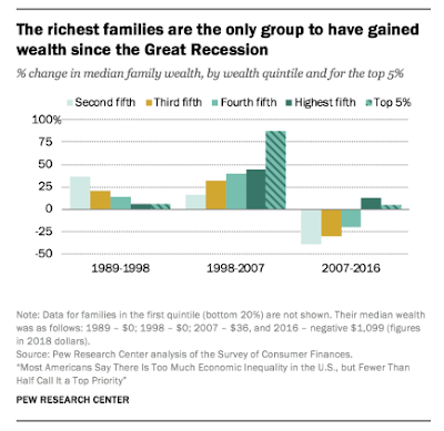
Wealth in the US is more disparate than income! The inequality is shocking:

Here is another representation:
This video from the ST. Louis Fed also explains the disparity in wealth in the US (2019).
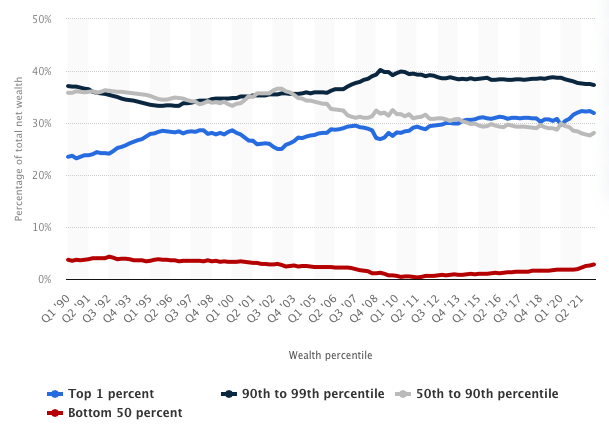
The overall conclusion about wealth is that the disparity of wealth is greater than that of income (see the pie graph below). The top 1% of America owns 34% of everything. The top 10% owns 70%. And half of America owns 96% of everything. In other words, the bottom half, 50% of America, owns almost nothing. They have no money saved - for retirement or otherwise. Once you deduct their debts, they have almost no equity - from their homes, or possessions, or bank accounts.
Inequality.org explains the rising wealth inequality, even during the pandemic.
For a much more detailed analysis of wealth, see this post from business insider which explains the wealth by demographics like age, race, and two components of social class that we will examine next: education and location.

Here is a 2011 post from sociological images that has a lot of info showing the connection between your degree and your income, especially that more than any other factor, educational level contributes to lifetime income earnings and the earnings gap gets wider over time.
"...income gaps between fields are often larger than gaps between those with college degrees and those without them. Natasha Quadlin finds that this gap is in many ways due to differences in funding at the start of college that determine which majors students choose....She finds that students who pay for college with loans are more likely to major in applied non-STEM fields, such as business and nursing, and they are less likely to be undeclared. However, students whose funding comes primarily from grants or family members are more likely to choose academic majors like sociology or English and STEM majors like biology or computer science."
- BluesMatch, a company based in London that matches Oxford, Cambridge, and Ivy League graduates, said it makes sense that as people experience search fatigue from broad, impersonal online dating pools, they’re drawn to sites that narrow the field by matching users’ interests or backgrounds. “People get tired of using Tinder or Match because there are too many people,” said Law during a Skype chat from London. “And they often don’t have the level of conversation that someone from Oxford or the Ivy League gets excited by.”
- Elegant Introductions out of Miami, are matchmakers for a clientele based in Miami and Boston. Most of their clients, said Gold, are highly educated and professionally successful, are involved in their community, appreciate the arts, and have been screened to make sure they are who they say they are. Applicants have to show proof of an Ivy League degree.
Elite Colleges Constantly Tell Low-Income Students That They Do Not Belong from Clint Smith in the Atlantic.How Admissions Really Work: If The College Admissions Scandal Shocked You, Read this from NPR.There are lots of ways that wealthy families get a boost in the college admissions process. Most are quite legal.Paul Tough's book, The Years That Matter Most is a deep-dive sociological look into college and social class. From the NY Times book review,"... today, whether you graduate from college is largely determined by your parents’ income. In the United States, 77 percent of children born into the top income quartile will earn a degree by age 24, but for the bottom quartile that number is a mere 9 percent. The implications are clear: The education system isn’t transforming the lives of those who need it most; it is dispensing ever more opportunity to those who need it least."
Social Class Component 4: Location
Examining the largest 384 metro areas in the United States, Chicago is the 3rd most populous at 9 million people. There are different ways to measure the median metro area, but regardless of how it’s done, it is substantially smaller than Chicago. Examining the median individual American, they live in a metro area closer in size to the 50th metro region such as Fresno, CA, Grand Rapids, MI, Rochester, NY or Tulsa, OK, just above 1 million people. However, the median metropolitan area is Yakima, WA or Baldwin County, AL. Either way, the typical American lives in a small city - much smaller than the Chicago metropolitan region. And this geographic disparity of location is connected to income and class.
13. How do you think where college grads move affects social class in the U.S.?
Extra Data about Home Price:Location and home price:City-data has census data by census track including the average home price (as well as income and other data).
15. How do you think your home's value compares to the average home price? (Remember from the wealth section above, the average American owns a home.)
Location and health
Research from Melody Goodman, an assistant professor at Washington University in St. Louis presented at Harvard School of Public Health shows that zipcode is a better predictor for health than genetic code:
Residents to the north of Delmar are less likely to have a bachelor’s degree and more likely to have heart disease or cancer.
More recently, Damon Tweedy from Health Affairs summarizes new research from David Ansell, senior vice president and associate provost for community health equity and a professor of medicine at Chicago’s Rush University Medical Center,
Headlines portray Chicago, Illinois, as the epicenter of urban gun violence. But most premature deaths among Chicago’s black residents are caused by heart disease, diabetes, and cancer. In his new book... Ansell asserts that structural violence is the true cause of the dramatic...differences in death rates and life expectancy across Chicago neighborhoods. According to Ansell, this form of violence—rooted in past and present social, economic, and racial inequality—saps the lives of residents in poor neighborhoods and results in the death gap. Chicago, in this narrative, is a microcosm of America.
In this new book, he takes a larger view, focusing on how factors outside of the health care system—neighborhood segregation, in particular—affect health.
And Clint Smith, a Washington DC teacher explains in his slam poem the ways that location affects his students. As you watch, make a list of the ways that location affects them:
An online data tool called Opportunity Atlas finds a strong correlation between where people are raised and their chances of achieving the American dream.
Here is an NPR piece explaining it.
Here is the NY Times Upshot explaining it.
Opportunity Insights provides data about how neighborhoods shape residents' life chances.
This report from NPR's Planet Money details how where you grow up can affect your income later in life.
And here is a video and stats from CNN Money that show how where you grow up limits or benefits you.
Power, according to Max Weber, is the ability to impose one's will on others. Weber focused on three ways that power shows up in everyday life:
- Traditional authority - power because of social or cultural tradition like royalty or religious leaders
- Rational-Legal authority - power from law and legitimacy of the state such as judges and police
- Charismatic authority - power that comes from personal qualities that create influence over people such as Kim Kardashian or Michael Strehan
Some examples of power are the abilities to keep yourself out of jail, influence politicians and enact laws that you favor:
Here is one example from The Daily Show comparing teachers and Wall Street Investors. Can you guess who has the power? Video is available at Youtube here.Here is a link to a Washington Post article explaining that wealthy Americans use their power to create favorable government policies.This 2019 ProPublica report found that the IRS is LESS likely to audit wealthier Americans because it is more costly and difficult.And this article from the NY Times shows that an executive at United Airlines accused of corruption charges was forced to resign. Imagine if a teacher was accused of corruption and was forced to resign. That would be it - out of a job and no compensation. But,United filed a report with the Securities and Exchange Commission on Tuesday indicating that Mr. Smisek would receive nearly $4.9 million in a separation payment, and 60,000 shares of stock, valued at over $3 million.
Some more local examples of a contrast in power among wealthy and powerful compared to low income and powerless:
Choose one of the examples above. Which did you choose and what is the power being exerted?


No comments:
Post a Comment